SG Markets WebClear

SG Markets WebClear

My journey rethinking Societe Generale’s key platform for real-time cash management, payment tracking, and transaction monitoring

My journey rethinking Societe Generale’s key platform for real-time cash management, payment tracking, and transaction monitoring

Client Societe Generale CIB
Role Lead designer
Timeline 2023 Present
Focus areas
service design prototyping responsiveness
SG Markets WebClear main cover image

This case study shows limited information

Some details of this work are intentionally limited due to confidentiality constraints. If you’d like to dive deeper into my work, feel free to reach out.

WebClear is a long-standing service within Societe Generale’s Global Transaction Banking suite. In 2023, it began a strategic migration to SG Markets, the bank’s modern platform for corporate and institutional clients. The objective of the migration was to modernize the experience, align it with SG Markets standards, and support future scalability. My mandate was to lead the UX vision and workflow redesign, introducing a user-centered design approach across the product team, and supporting technical teams in creating a responsive experience.

Iterative approach

The project progressed in cycles, defined and planned together with the product team and considering business priorities, UX needs and the global roadmap. Each cycle focused on a portion of the service, moving from discovery to validation.

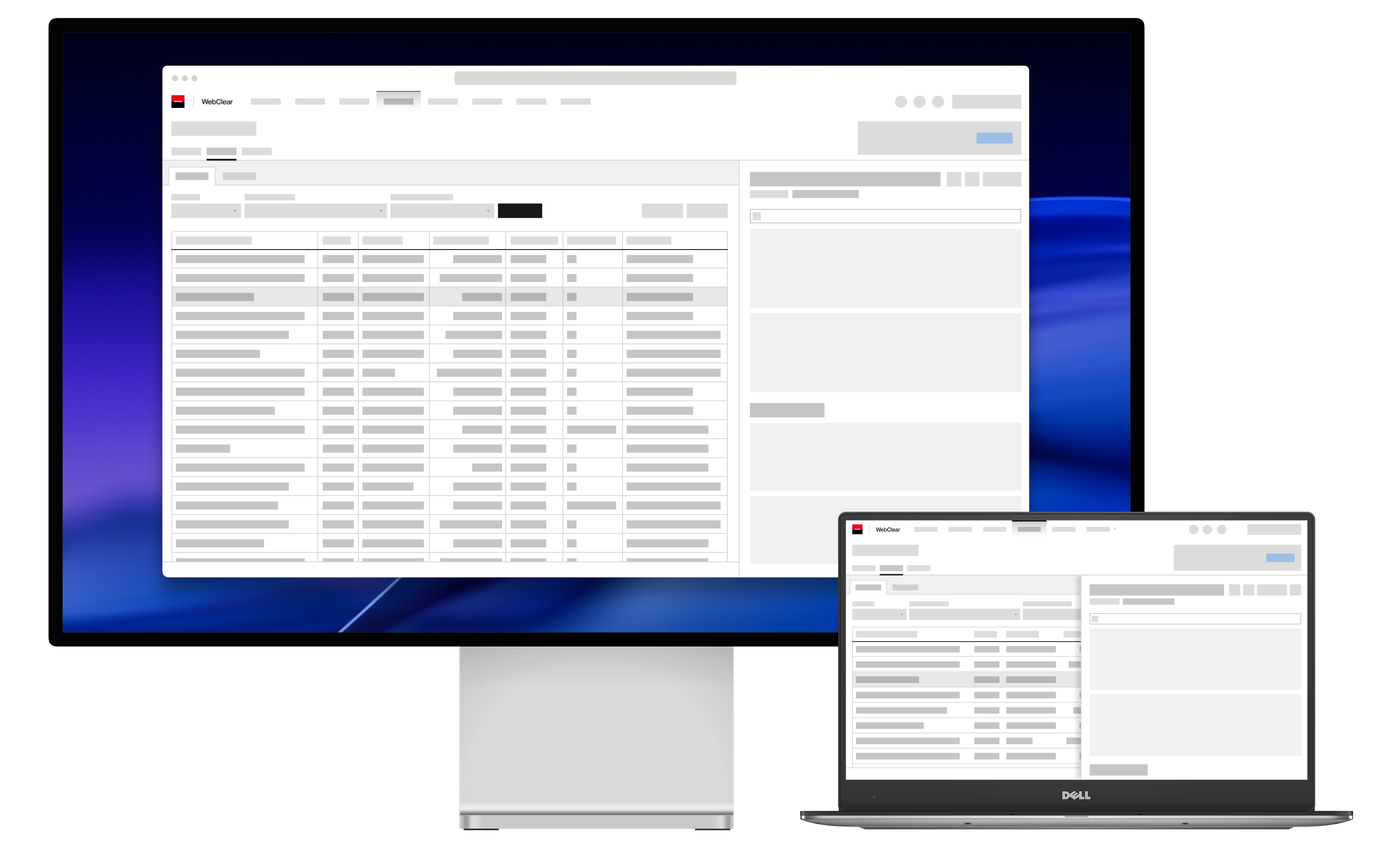
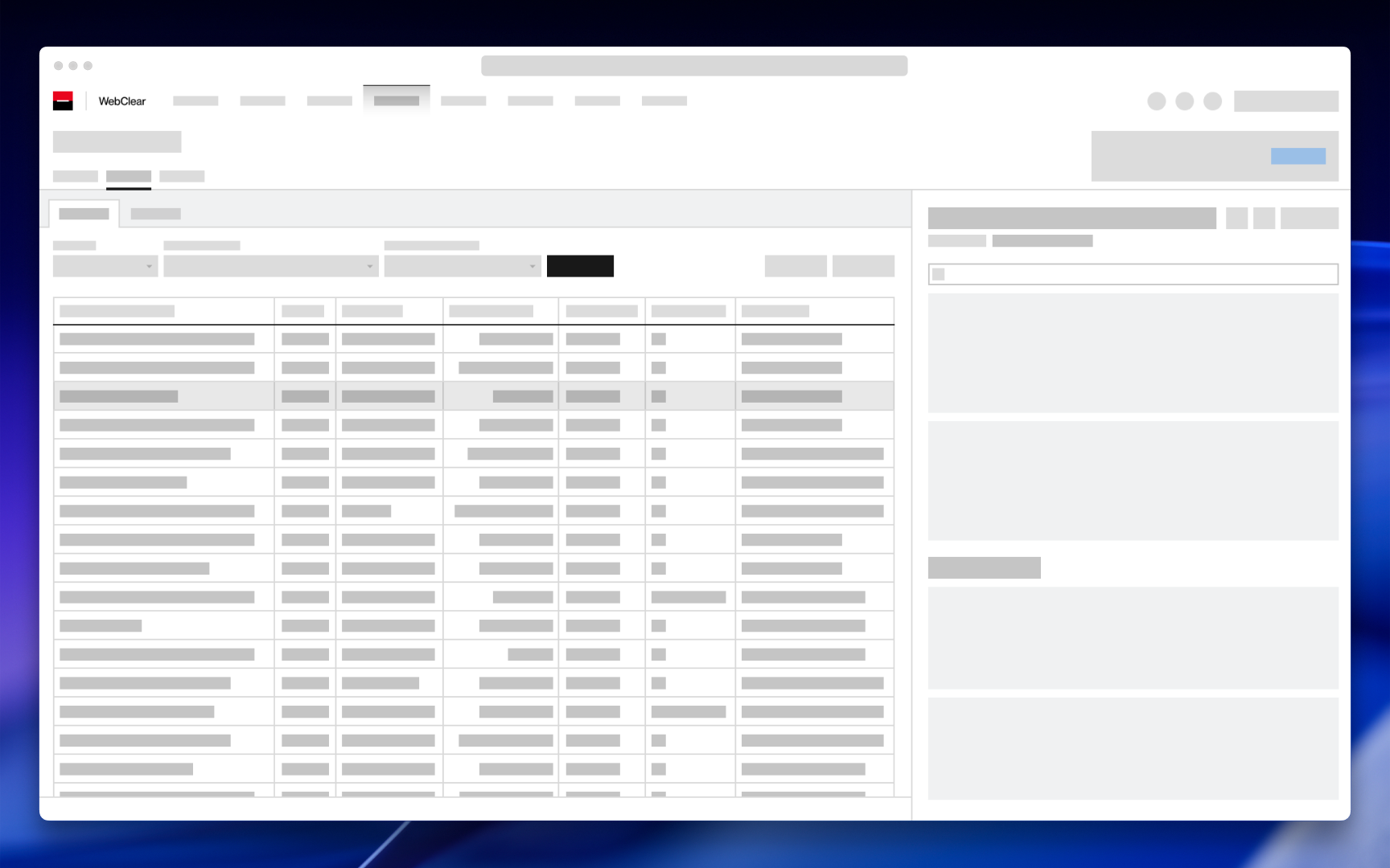
Since we were working within the context of a platform migration, I prioritized reworking the core components and navigation first, and then implemented a strategy to maintain the legacy code within the new experience, while the rest of the parts were being built.

1. Framing & discovery

Working closely with the product team and expert users, I formalized the problem space, user personas, and data requirements. We mapped the existing user experience end to end to understand current journeys, and documented functional elements, data structures, and API dependencies. This provided a solid foundation for the redesign and gave us a shared view of constraints, pain points, and opportunities. Some key opportunities emerged:

  • Simplifying navigation by reorganizing it around user goals rather than technical data models.
  • Reducing task completion time through modern components and interaction patterns from our design system.
  • Adopting flexible, responsive layouts that take advantage of modern browsers for richer information displays and better adaptation to different screen sizes.
A diagram showing the four phases of framing and discovery

2. Wireframing & navigation model

We began each phase by refining user flows based on the identified opportunities and updated data requirements, ensuring alignment with both BU and SG Markets standards. Together with the product team, we iterated on these flows through a series of workshops until navigation, actions, and displayed data were fully defined and understood.

Using these validated flows, I created wireframes that covered individual screens as well as the overall navigation structure. We reviewed and refined these wireframes weekly with product owners, developers, and expert users. A key focus during this stage was designing content-first, reusable layouts and test responsive behavior to anticipate technical constraints early in the process.

A diagram showing the different grid systems used in our design
Using different base layouts was key to address the diversity of information displayed in the service

3. Prototyping & testing

Once the structure was validated, I created interactive prototypes in Figma aligned with the SG Markets design system. To ensure continuity and scalability across the platform:

  • I built reusable design components for shared platform elements.
  • I created templates for recurring information patterns.
  • I established breakpoints and designed key screens across multiple sizes.

We then tested the prototypes with representative users, refining interactions and layouts before handoff. The consistency achieved early through shared components and templates significantly accelerated subsequent delivery cycles.

Two screen diagrams showing the responsive behavior of an information-dense page
Responsive behavior on pages with high information density
Two screen diagrams showing the responsive behavior of a page containing forms and actions
Responsive behavior on pages with forms and actions

Collaboration

With the product team

We established shared rituals to integrate UX seamlessly into the product lifecycle. This included presenting our UX methodology and expected deliverables, mapping responsibilities across each phase of the design cycle, and visualizing the UX plan in shared documents aligned with the global roadmap. Over time, we refined this collaboration rhythm, ensuring smooth alignment and efficient decision-making during our weekly working sessions.

With the development team

My priority was to involve developers from the earliest stages of the design process, especially given the migration context and the technical challenges introduced by responsive layouts. By testing solutions both in Figma and in development environments, we were able to refine breakpoints and layout behaviors early, ensuring a seamless experience across devices.

Developers’ input helped us identify edge cases sooner and validate user flows with technical feasibility in mind. As a result, we enriched our handoff materials with detailed interaction states, accessibility considerations, and logic specifications to support accurate implementation.

Throughout development, we held weekly follow-up sessions to review component and layout progress, and conducted design reviews directly in test environments to ensure the final product remained faithful to the intended design.

Outcomes and impact

The redesigned experience delivered several key benefits:

  • A simplified navigation structure, making key user paths up to three times faster.
  • Reduced task completion time through modern components and useful shortcuts.
  • Consistent layouts that improve scanability and support different types of tasks.
  • A responsive interface validated across the range of client screen sizes and usage conditions.
  • Defined UX metrics to measure user adoption and overall experience quality.
  • Clearer feedback and guidance throughout user actions, reinforcing confidence and clarity.
  • Strong alignment with the SG Markets design system, ensuring cohesion across the broader ecosystem.

This project established a scalable UX foundation for WebClear within SG Markets and strengthened collaboration between product, design, and engineering teams.

Next on

Next on

Orient'Est Métiers

Research-driven project exploring how playful design can enhance engagement in digital career guidance tools, developed at KTH in collaboration with Addeo